
Here is a selection of some of the watch image collages I have created recently. I find these handy for grouping together pictures having a theme. You can click on the images to see larger versions.
 |
 |
 |
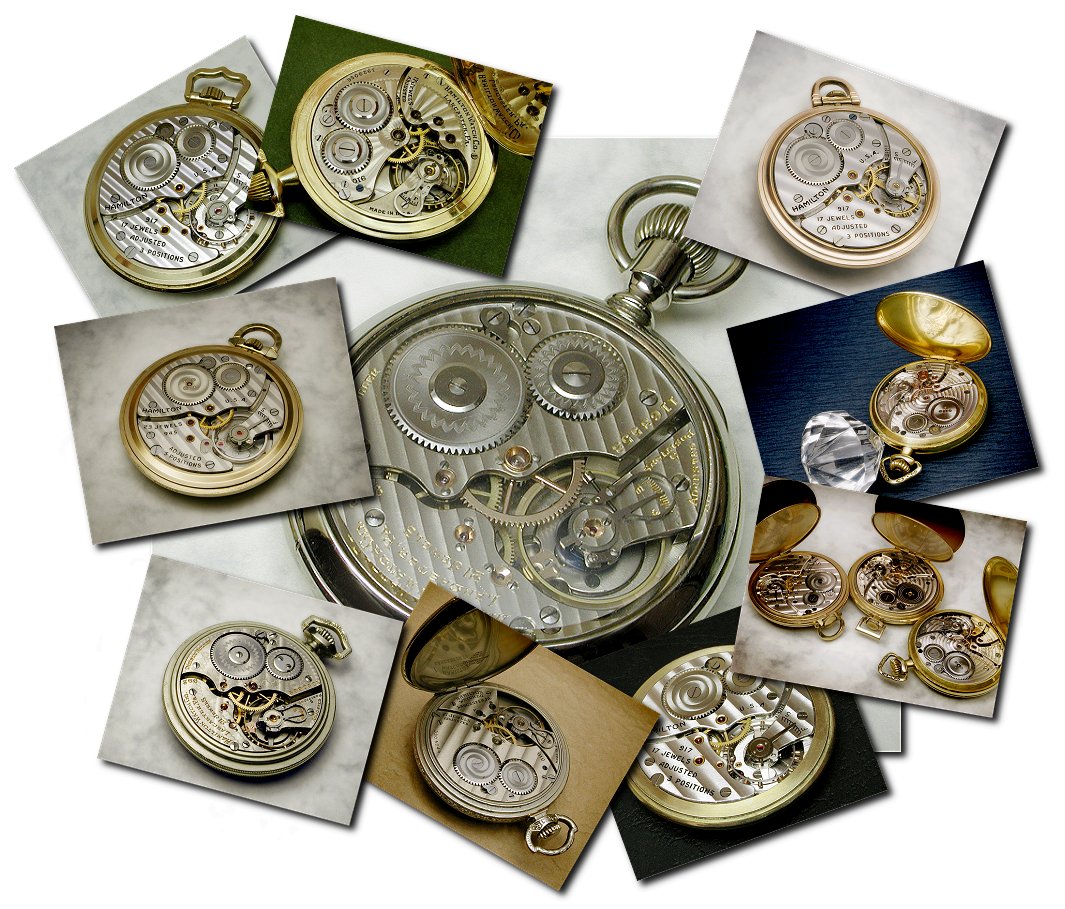 |
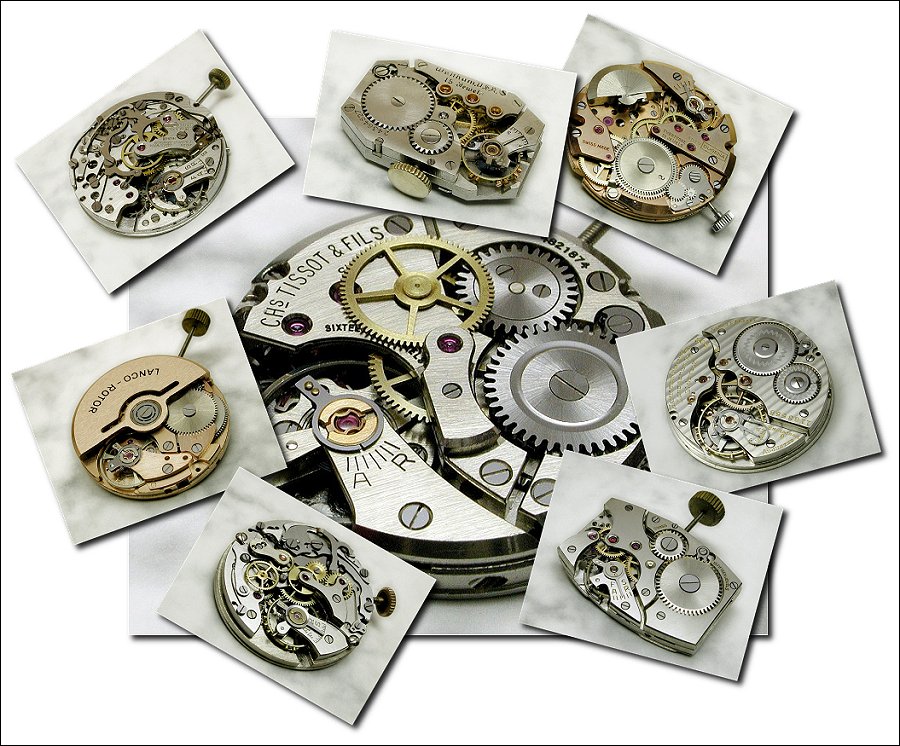
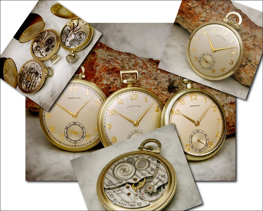
| Vintage movements - click to enlarge | Hamilton 912 watches - click to enlarge | Accutrons/Accuquartz - click to enlarge | Hamilton movements - click to enlarge |
 |
 |
 |
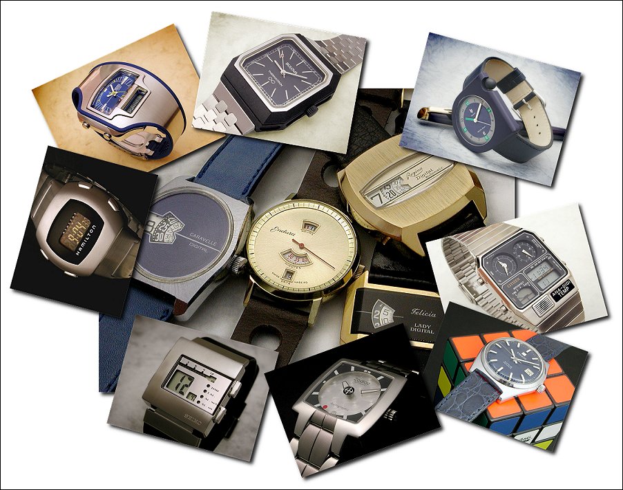 |
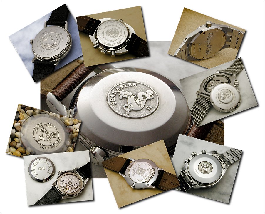
| Hamilton 10 size - click to enlarge | Seiko Orange Monster - click to enlarge | Caseback markings - click to enlarge | Funnies - click to enlarge |
 |
 |
 |
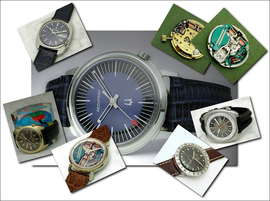 |
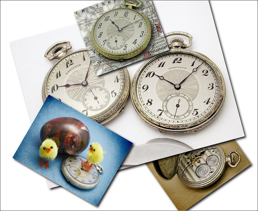
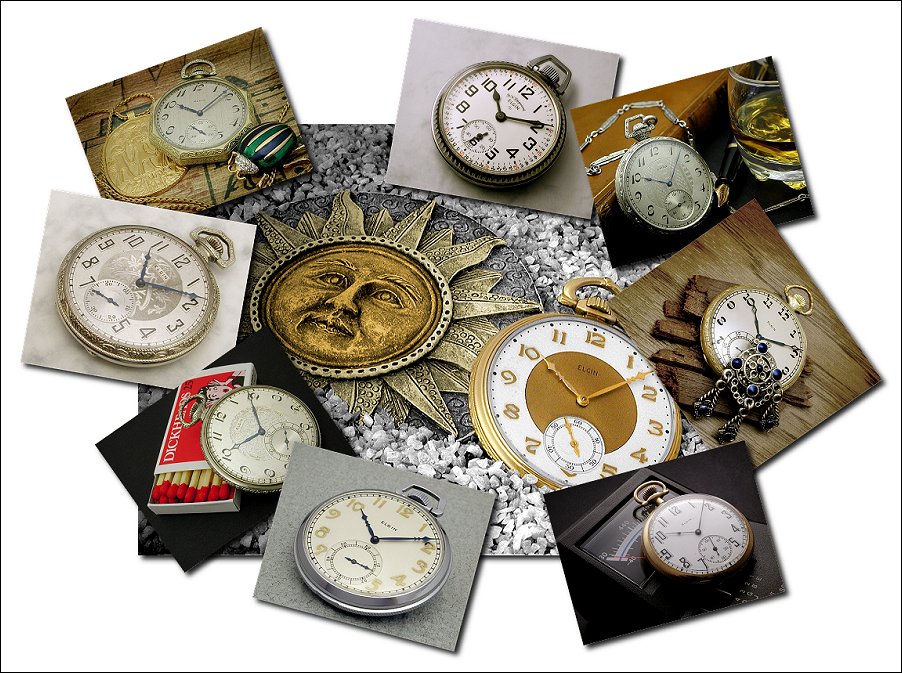
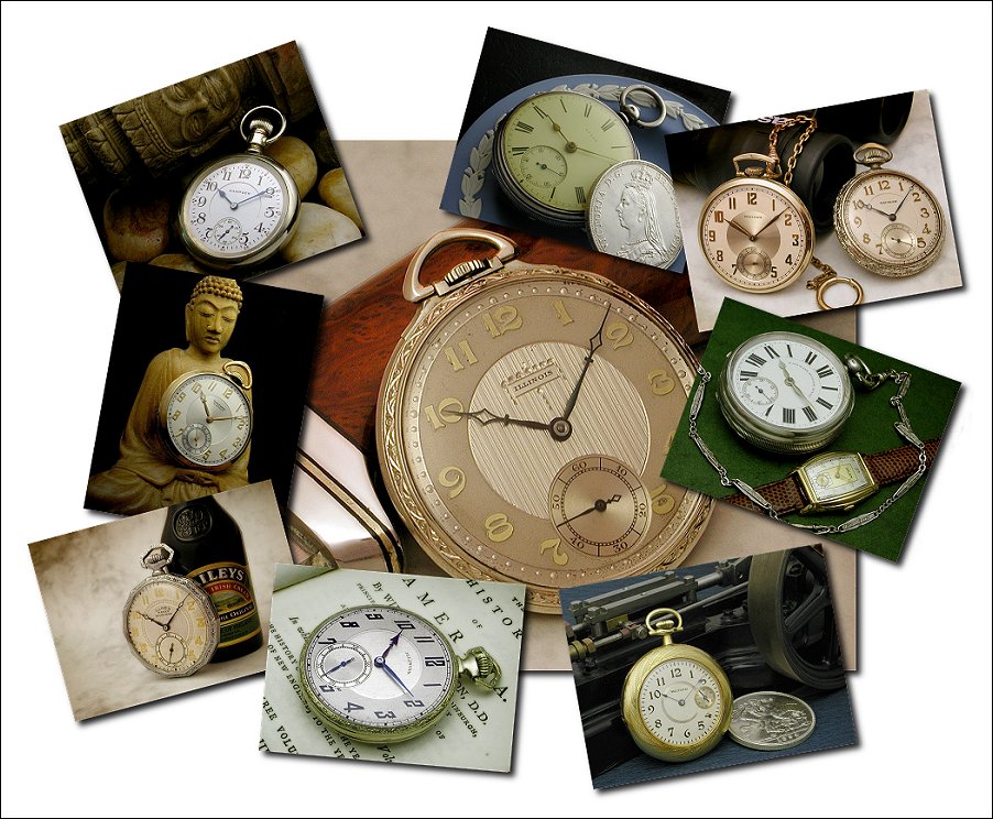
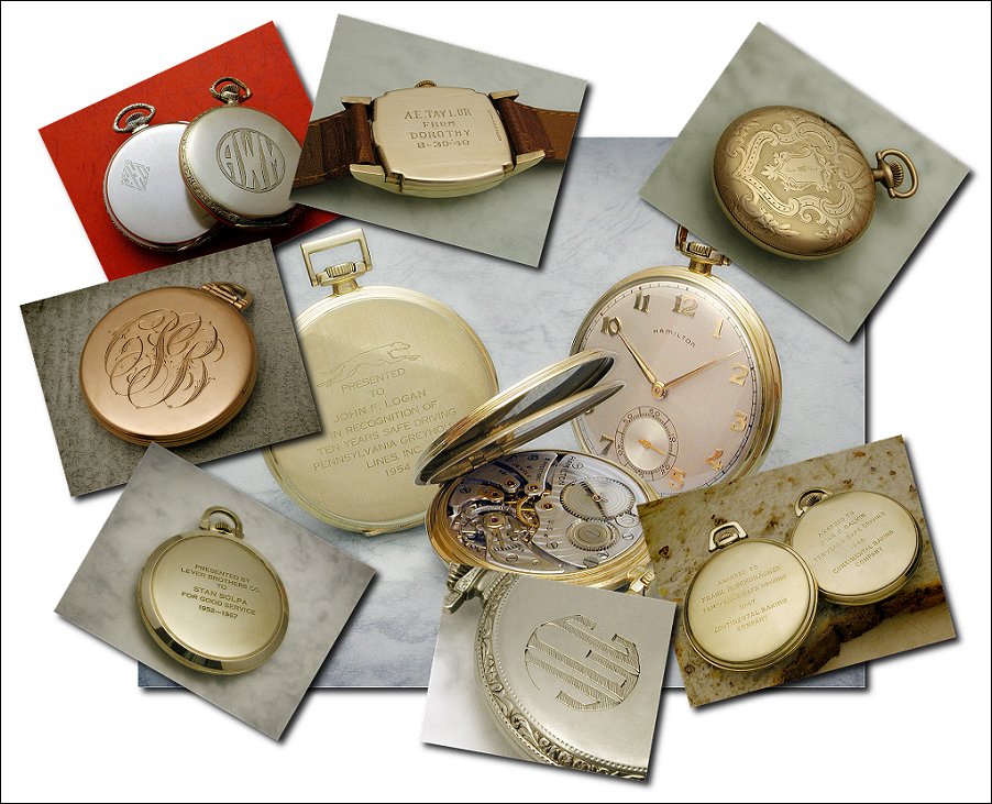
| Elgin watches - click to enlarge | Assorted pocket watches - click to enlarge | Caseback engravings - click to enlarge | Accutrons - click to enlarge |
 |
 |
 |
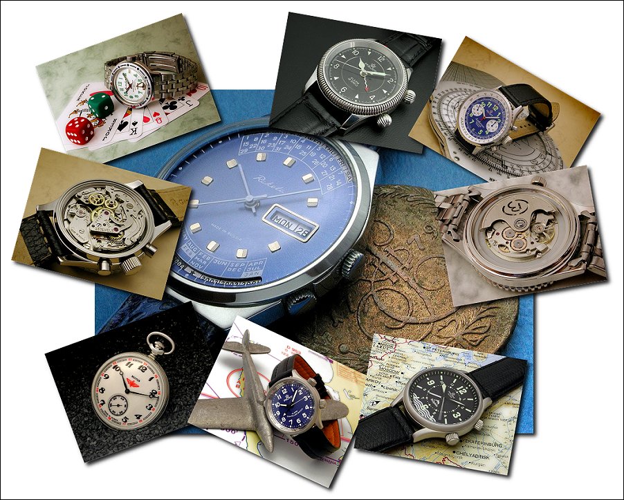 |
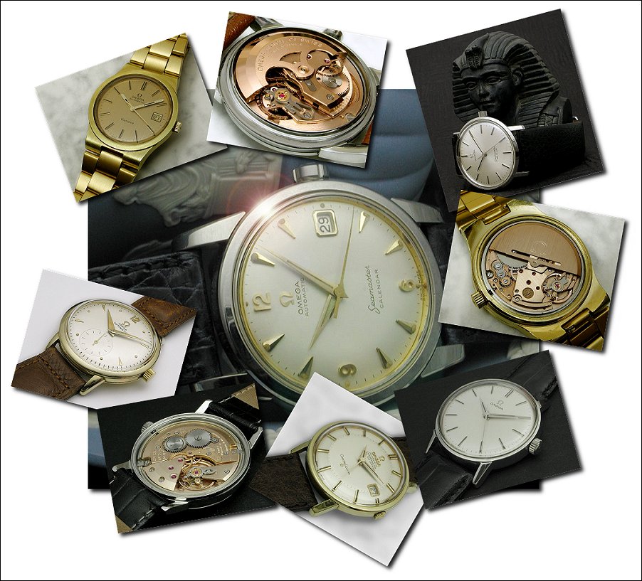
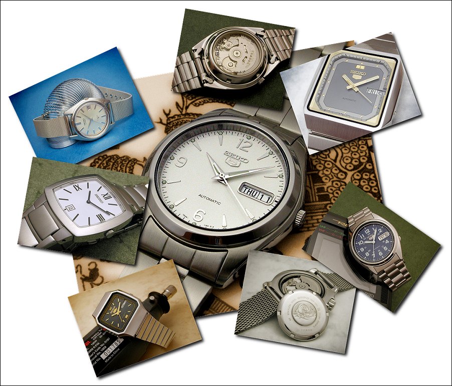
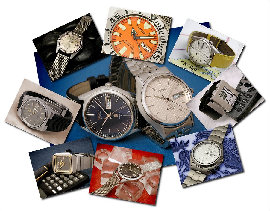
| Omega watches - click to enlarge | Seiko watches 1 - click to enlarge | Seiko watches 2 - click to enlarge | Russian watches - click to enlarge |

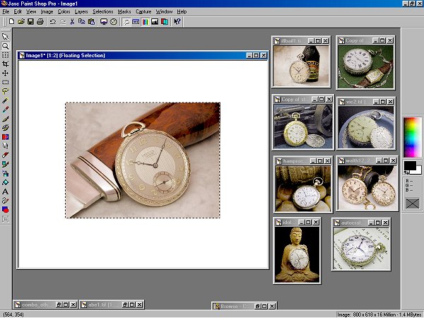
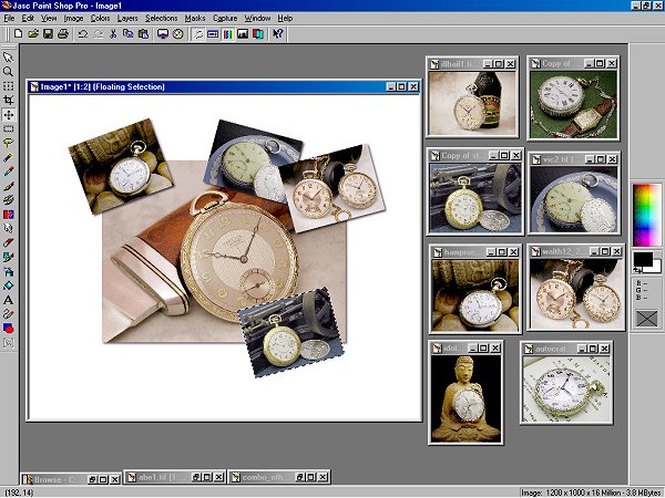
These collages are fairly easy to put together. Half the work is finding individual pictures that you think would go together to make an interesting grouping. You could use images you already have on hand or shoot new images specifically for such an image. Below is a summary of the process I used to create these collages. Once the pictures to be used are selected I generally lay them out as shown below. I'm doing all of this in Paint Shop Pro, but Photoshop should handle it at least as readily. The main picture is chosen because (1), I like it, and (2), it has suitable colouring and enough empty space around the edges so that the main subject won't get too covered-up by the small frames later. The process so far...
- create a blank white canvas of suitable size so that when the main picture is pasted onto it there is sufficient room around the edges to fit the small frame pictures.
- appropriately size and paste in the main picture. I'm using a black drop shadow around the picture to lift it from the background and create a "framed" look. You could very well use another form of bordering. Note that the main picture need not be placed horizontally. In some of the examples above I have angled it slightly.
Below is the result so far. I keep the pictures I have selected for the small frames visible so that I can choose which will go where. This could be based on many things, but the colours are definitely a main aspect. I aim to spread the lighter and darker images out, giving them some balance, (but not necessarily symmetry). I find there is a limit to how small I can make the frames without losing too much detail, but that's up to the individual and the specific images.
Below I'm getting stuck into the image and have placed a number of small frames. Each picture is resized and pasted into the selection, rotated as desired, sharpened, (to restore crispness lost in resizing), and then placed in position. Each picture is given a drop shadow frame, again to lift it from the background and main picture. I find lighter-coloured images generally work better in this regard, but often I have a variety of colours to work with. I keep going until all of the pictures are positioned as desired. This can be a bit of trial and error. The 'biting' into the main picture needs to be controlled so as to not cover up anything too important, but still look natural. I crop away extraneous white background and then, as the original is a fair bit larger than I need for displaying on the net, I resize the whole thing, (down to 900 pixels wide in this case). Again, I find I need to sharpen to restore crispness. Finally a thin black border is added and the image is finished.
This technique could be taken a step further by making the collages into image maps so that each small picture becomes a clickable thumbnail linked to a full-size version of that image.
Copyright 2005 Paul Delury
(Watches from the collections of Rob B, Tom G, and myself).