
I like to revisit my watch images, sometimes months or years after I've 'finished' them. Often in the meantime I will have learned some new techniques, changed my style, or simply see that something different can be done with the image. Sometimes I was never completely happy with the results I had. To that end some watch images can evolve through various versions over time, such as with the example below.
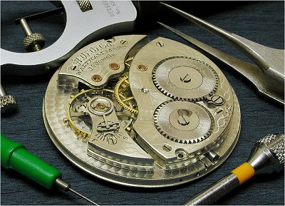
Here is a photo of a vintage Waltham pocket watch movement I shot some time back. I surrounded the movement with various watchmaking tools. This was straightforward image in full colour and I was reasonably happy with it at the time.
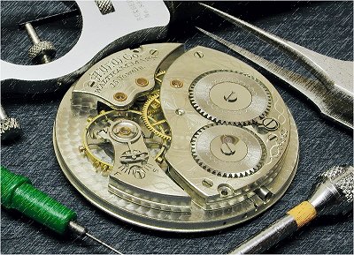
Many months later I revisited the image and decided to work on it further. I wanted to make the movement gain more prominence. To that end the first modification was to select the watch movement, invert the selection so that everything but the movement was selected, and the Photoshop 'Sketch' filter was applied to give the surroundings a 'sketchy' look. This effectively de-emphasized the tools.
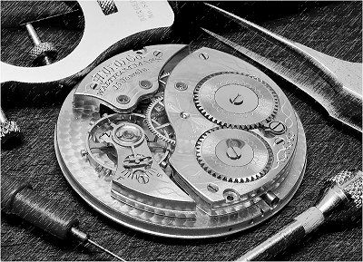
More recently I looked at the image again and thought some selective colour work was in order. To this end a black and white version of the image was created, as shown at left. I simply converted the image to grey scale and boosted the contrast to counter the flatness that often comes from a straight conversion.
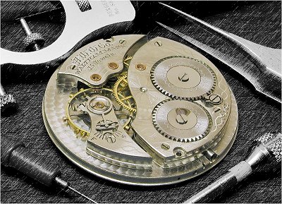
I then layered the black and white image over the colour one and selected the movement. The black & white layer was erased, allowing the coloured movement to show through. I felt that this treatment centered even more attention on the movement, and for some time I was quite happy with this version. That situation was to change!
Below is the latest version of the image. I decided to restore colour to the background and also wanted to address an issue that had been bugging me for some time. The image was too symmetrical. The four watch tools were too even spaced around the movement, causing the setup to appear a bit too contrived. Balance is generally good in photography, but symmetry often isn't. I decided to remove the green-handled watch oiler in the bottom left corner of the image. This was fairly easy as I could clone the surrounding background texture to fill this space. The empty space allows the eye to be drawn more readily to the main subject and I feel this change has improved the overall image. So, there it is, the latest in the evolution of a watch image...for now, at least!
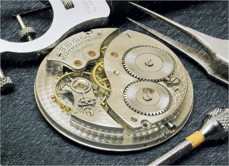
Watch movement from the collection of Rob B.
Copyright 2005 Paul Delury