
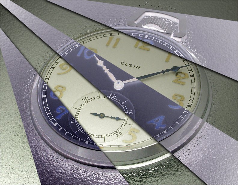
You're moving into a land of both shadow and substance, of things and ideas. You've just crossed over into the (watch photo) Twilight Zone.
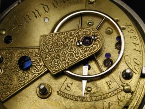
The close-up shot of the English lever fusee movement at left is straightforward. I liked the engraved balance cock and decided to make it a feature of a modified image. To that end I first cropped the image a little and then selected the balance cock and completely desaturated the rest of the image to lose all colour. I also applied a degree of the Photoshop "Diffuse Glow" filter to boost the monochrome effect. The balance cock itself was left with the original coloring. The result can be seen below. The aim was to produce a poster-like art image.
Using selective colouring like this is a simple way to alter an image. More examples can be found HERE .
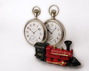
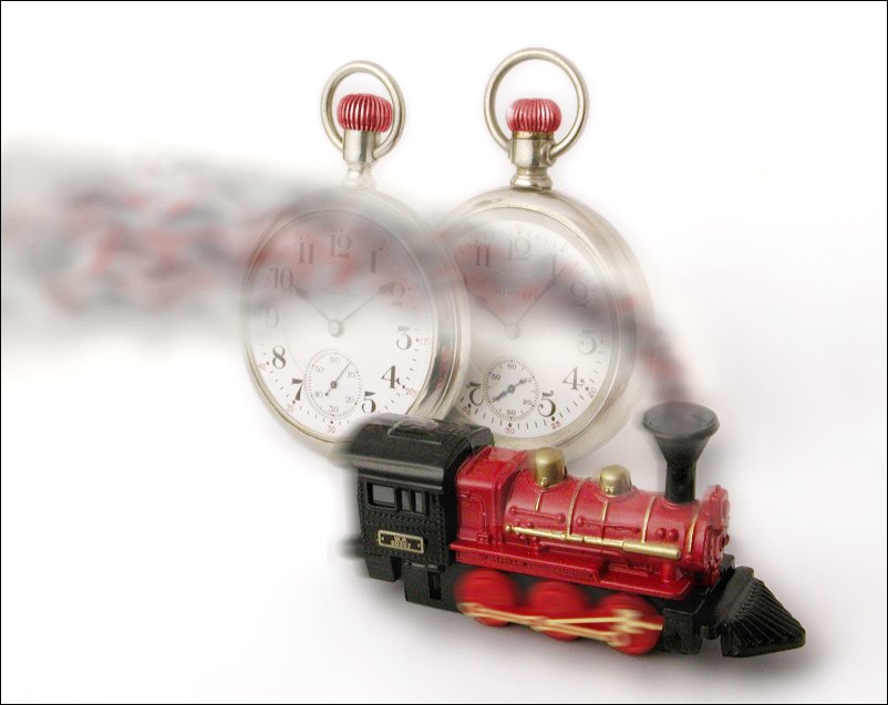
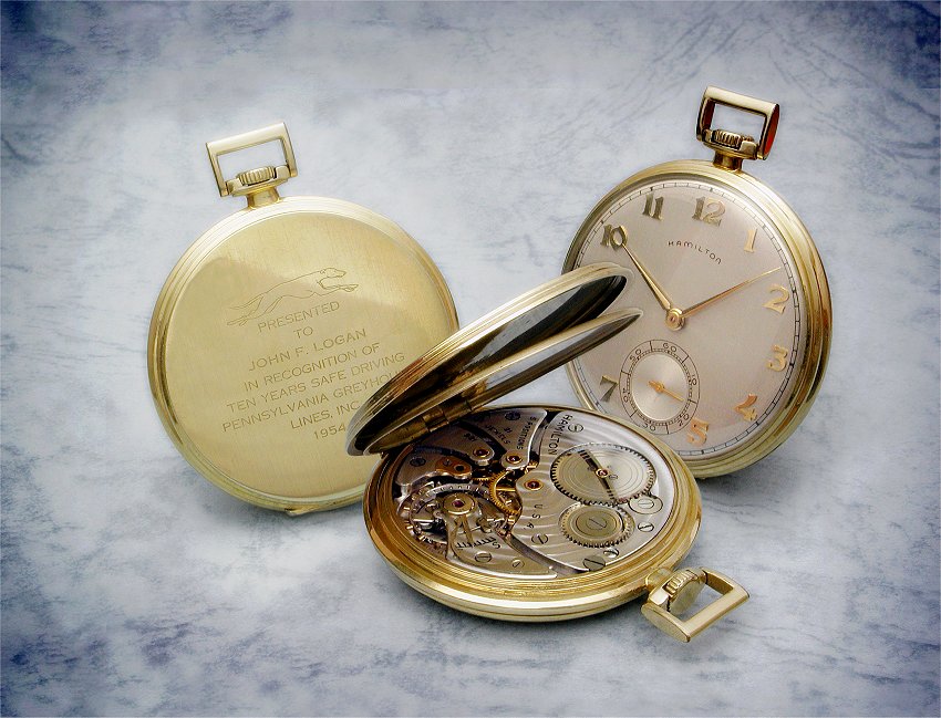
A simple themed idea - two railroad grade pocket watches to be shown with a locomotive. However, I did want it to be a little different. This was to be a semi-surreal image and hopefully also a bit whimisical.
You can read more about the production of this image HERE but in short it is based around the setup seen to the left. The watches were supported upright from behind by blu-tac putty. The loco was obtained from a toy store. The subjects were positioned on white art paper curved up behind to provide a seamless background. The smoke was drawn freehand in Paint Shop Pro in a separate image and the two images were then layered and combined. I also used some judicious motion blur to imply that the loco was moving. A later addition was to colourize the crowns of the watches to match the red of the loco.
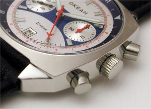
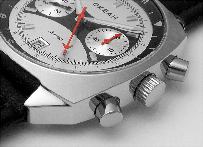
This is another example of simple selective colour work. The image at left is itself a full-colour crop from a wider shot of the watch. Whilst this chronograph has a rather colourful dial, I was drawn to featuring the bright red center and subdial hands.
To isolate the red hands I made a grey scale copy of the image and then layered the grey scale copy over the colour image. I selected the hands and erased the grey scale to reveal the red. That's it, very simple but effective and similar methods can be used wherever desired. More subtle effects can be achieved by only partially desaturating the rest of an image to feature some portion.
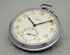
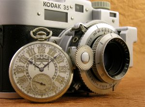
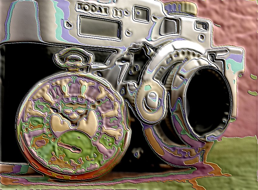
What can I say? Sometimes I get bored with 'normal' watch photos! I was looking to try something different and settled on this pocket watch image I had shot some time previously. I chose it as it had large areas of watch which I thought may react well to what I had in mind.
The effect you see below was achieved by selecting areas of the image and inverting them to produce a negative image. These areas were also given a blurred drop shadow to lift them a little above the base image. It's a simple effect and I have experimented more on some other watch pictures you can see HERE , leading to some distinctly unreal images.
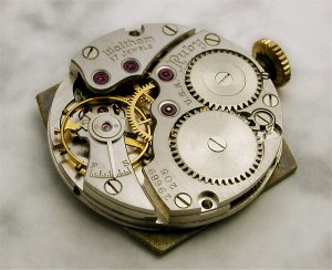
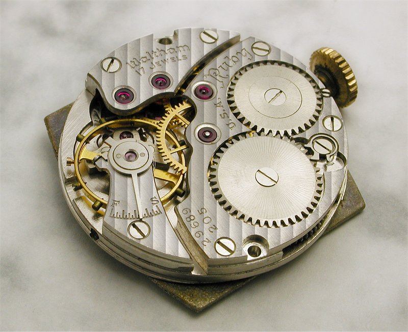
A chance discovery whilst playing around with Paint Shop Pro filters lead to this method of altering reality. I found that the "Blinds" filter could be used to produce ersatz straight-line "damascening" decoration as often found on watch movements. The first victim was the image of the vintage Waltham movement at left with a plain-grained finish.
Below you can see the change to the movement. It now has damascening that, without looking too closely, doesn't look too bad. This was just a bit of fun and really doesn't have much real-world application, but then that isn't the point of much of this stuff. You can find more info on this method HERE .
Here's another example of the use of selective colour. The subjects in this picture led to it being largely monochrome in nature. As you can see at left the watch case in the original image is silver in colour. I wanted to lift the watch in the image and decided to change the colour of the case.
This was a simple exercise. The watchcase area was selected and the "Colourize" tool in Paint Shop Pro was used to alter the colour. This adds a translucent tint of variable hue and intensity without covering any detail. I tried a number of colours before settling on the blue as seen in the image below.

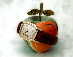
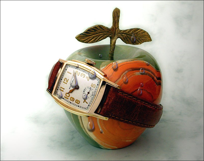
I suppose you could say this image had already departed from reality as I originally shot it, shown at left. Or do we all rest our watches on ornamental apples? Hmmm...
Anyway, a while back I discovered the "Picture Tube" feature on Paint Shop Pro which allows you to paint in a variety of pre-set objects. I was playing around with the water droplets and thought they might go well with this apple image. They aren't as good as the real thing, but they're easier to control!
Water tends to be wet and floppy. You may well have noticed this. This makes water a potentially difficult material for use in watch photos. There are ways to avoid it, as there are always ways to avoid reality.
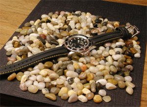
At left you can see how the original image was shot, simply a watch lying on a bed of multi-coloured pebbles. The intent of this setup was to allow a facsimile of the watch in water to be produced. To this end the area round the watch, including some of the watch case & lugs, was selected and in Photoshop the "Ocean Ripple" filter was applied to simulate, well...ripples. A few drops of real water were placed on the crystal. As a final touch I added a small lens flare to the rim of the watch, just right for a simulated day at the beach.

The image at left was shot with a purpose in mind. In itself it is a straightforward shot with the watch propped upright against a seamless blue background. The watch was positioned in frame to allow the a theatrical spotlight effect to be added.
Below you can see the result. This was achieved using the "Render/Lighting" effects in PhotoShop, and more info on this image and others can be found HERE .
It can be easy to overuse the more gimmicky effects available in photo editors. More often it is a matter of experimenting with them to see what can be achieved and then more subtly integrating them into images.
Then again, sometimes it's fun to lay it on heavily! For this watch image I applied the Paint Shop Pro "Soft Plastic" texture tool. I liked the odd, 3D melting appearance that resulted.
Sometimes one viewpoint on a watch just isn't enough. We like to see the back, and the movement, as well as the dial. At the left is the start of a composite watch picture to show all this in the one image.
Below is the resulting image which gives a view of one watch that cannot be seen in reality. Much of the work involved in producing such an image is in the planning, and more info on this and other similar images can be found HERE .
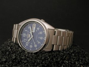
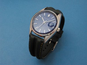
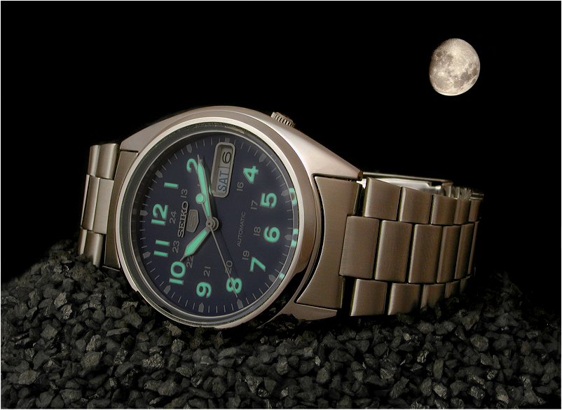
What's this? Just a Seiko watch sitting there, not doing anyone any harm. Nothing to be concerned about here. Unless, that is, I decide to move the image away from reality (and of course, I do :-)
This involved two main alterations to the basic image. I wanted to highlight the luminous markers and to that end layered together the base image with one in which I exposed only for the luminous markers, (more on a method to achieve this can be found HERE ). I mixed the layers to create an image simulating twilight (or Moonlight in this case) in which the watch itself is still visible. The second alteration was to paste in an image of the moon I had shot earlier.
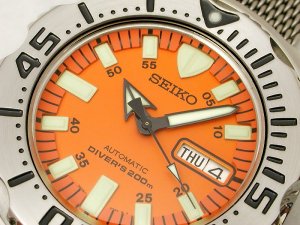
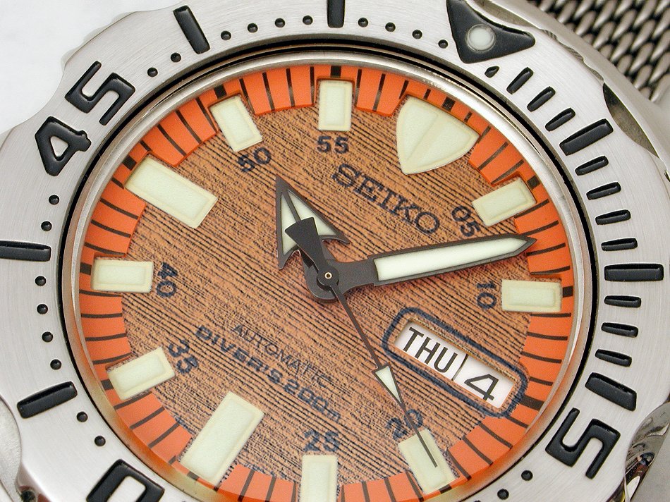
Hamilton made a series of watches with wooden dials in the past but I wasn't aware Seiko had recently done the same. The watch is based on their normal "Orange Monster" diver, as seen at the left.
After carefully selecting the tree I had tree fellers cut it down, (there were four of them but one went home after getting a bad splinter). But seriously, all you could ever want to know about the watch image below can be found HERE .
Copyright 2007 Paul Delury